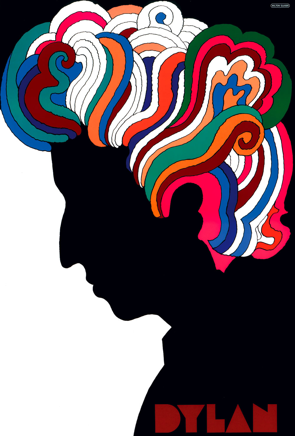
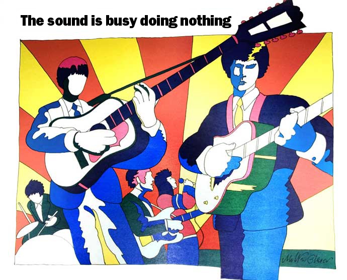
I really like Milton Glaser's work, his poster designs are bold, modern and simple, but I feel the his style is also original and colourful which makes it so eye catching and rememberable. His iconic I <3 New York Logo for example is so simple but has been designed in a way which is instantly noticeable and on a practical level can be easily applied to merchandise. He also handles some hard subjects such as Aids and Arthritis, and although doesn't deflect from the seriousness, still provides an aesthetically pleasing and rememberable campaign piece of work.


No comments:
Post a Comment