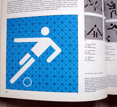
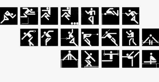
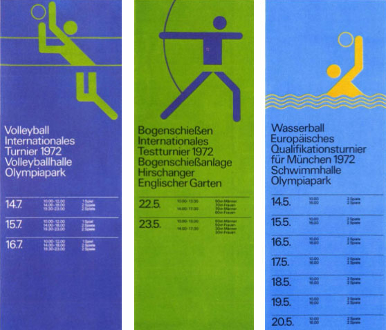
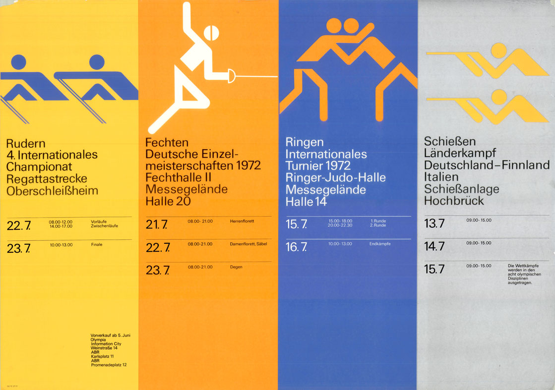
I really like Otl Aicher's classic logo design, the simple bold shapes are beautifully composed. And the contrasting colours used make the icons stand out and easily understood. This is probably why they were used for the Olympics as they were internationally recognised as symbols and this furthermore has inspired other symbol graphic design.

.svg/600px-Archery_pictogram_black_(1972_Summer_Olympics_style).svg.png)





This article provides real value instead of generic information. The practical tips and real-world relevance make it stand out from many other blogs on the same topic. https://vnainfotech.framer.ai/blog/top-ecommerce-website-design-companies
ReplyDeleteI thoroughly enjoyed reading this article. The content is detailed, easy to understand, and organized in a way that keeps readers engaged from beginning to end. I particularly appreciate the balanced approach, where you not only explain concepts but also provide actionable tips that can be implemented immediately. https://freecodeslab.framer.ai/
ReplyDeleteThis is the kind of resource that people can confidently recommend to colleagues and friends. Thank you for sharing your expertise and creating something that genuinely educates rather than simply informs. I'm excited to explore more articles on your website. FreeCodesLab